
A CEO's LinkedIn photo must be recognisable at thumbnail size, and the banner should carry one message that fits the company's identity. People scan both before they read a word, often on a phone. A clear headshot plus a clean banner with logo and either a tagline or a call to action covers most cases.
Why do the LinkedIn photo and banner matter for a CEO?
They are the first thing people see, and they see them before reading anything. The photo is a trust signal that gets judged in a fraction of a second. The banner is the largest area on your profile, and many executives leave it unused. Together they form the visual layer of your profile.
The rest of your profile makes the argument. My guide on the executive LinkedIn profile covers how the sections work together. This guide goes deeper on the two visual elements only.
How do people actually see your LinkedIn photo?
Small, briefly and without clicking. Many first impressions happen on a phone, inside the feed, while people scroll. In that moment your photo sits next to a post or a comment at a fraction of its full size. Nobody studies it. People scan it.
That changes what a good photo is. At first contact, three things outweigh their usual rivals:
- Recognisability: it matters more than aesthetics.
- Clarity: it matters more than styling.
- Trust: it matters more than expression.
A beautifully shot photo that does not read at thumbnail size fails in the feed, where most people meet you. The same photo also appears next to every comment you leave and in every search result, always small. Optimise it for that size first and for the full-size view second.
How can you test whether your LinkedIn photo works?
Open LinkedIn on your phone and find one of your own posts in the feed. Look at the small photo next to it without tapping. Would someone who has met you once recognise you at a glance?
When the answer is yes, keep the photo. When you hesitate, replace it. That single look tells you more than any detailed review of lighting or styling. If you replace it, consider a professional shoot for the whole leadership team. It gives the team a consistent look and tends to pay off for years.
What makes a good LinkedIn profile photo for an executive?
A professional headshot that holds up at small size:
- Framing: head and shoulders, facing the camera, both eyes clearly visible. A slight angle is fine.
- Quality: high resolution, good natural or professional light, and a current photo.
- Expression: friendly and confident, between stiff and overly casual. Eye contact with the camera.
- Clothing: appropriate for your role and your industry.
- Background: calm and uncluttered, so the face stays the focus. A bold background in your company colours can work when it fits the brand and does not compete with your face.
- Contrast: the photo should hold on both light and dark phone screens and should not blend into the feed.
The overall impression should match your role. A CEO or founder usually wants to come across as trustworthy and forward-looking. Malte Kosub of Parloa is a good reference: a frontal, approachable photo that sits seamlessly in his banner. Reid Hoffman shows that a bold branded background can work when the colour is consistent with the company.
What should be on a CEO's LinkedIn banner?
One message that reinforces your company's identity. The banner works like a billboard. It should use your company colours and logo, and it can add one more element:
- A tagline or company descriptor: Satya Nadella has used Microsoft's mission statement this way. Anton Osika pairs Lovable's slogan with the logo.
- An authority signal: a photo of you on stage or leading your team, or a line such as "Trusted by" followed by real client names.
- A call to action: for example "Check our open roles" during a hiring push, or a newsletter or report for marketing.
Pick one of these, never two. A banner is a billboard, and a billboard carries one message. A tagline plus a call to action turns it into a brochure. Some of the strongest banners carry no text at all: Mary Barra's carries one visual story, and Soups Ranjan of Sardine uses the logo alone.
How do you decide what your banner should say?
Start from what you want a visitor to think or do after your profile, then pick the element that supports it. A few typical cases:
- Hiring push: a call to action that points to open roles.
- Market position: a tagline or company descriptor that tells a stranger what your company does.
- Credibility with a sceptical audience: an authority signal, such as a stage photo or real client names.
Then check the banner you have against that goal. If it carries one specific message that supports it, keep it. If it carries none, or three, redesign it. The test takes a minute and saves you a banner that looks fine and does nothing.
What size should a LinkedIn banner be?
1584 by 396 pixels, in high resolution. Keep the design clean and bold. If the banner carries text, check it on a phone before you publish. Text that cannot be read on mobile comes off, because most visitors will never see it any larger.
Also check the area where your profile photo overlaps the banner. Text or logos placed there disappear behind the photo.
Should a CEO use a campaign banner?
For a strategically important moment, it can be worth it. A campaign banner runs for a limited time across the company and pushes one initiative. Marc Benioff used his banner to amplify Salesforce's Agentforce platform. Jay Chaudhry marked the Zscaler IPO with a team photo.
The rule stays the same: one message, and only while it is current. When the campaign ends, the banner goes back to its standard version.
Should the leadership team use the same banner?
A shared template for everyone is the simplest option. Role-specific variants can do more:
- Founders and executives: logo only, or logo plus company slogan.
- Sales roles: logo plus a sales message or a client quote.
- Hiring roles: logo plus a hiring message, such as which roles you are hiring for.
Either way, the team should look like one company. My guide on getting the leadership team active on LinkedIn covers the rest of that work.
What mistakes weaken an executive's photo and banner?
For the photo:
- an unfriendly expression, odd angles or strange cropping
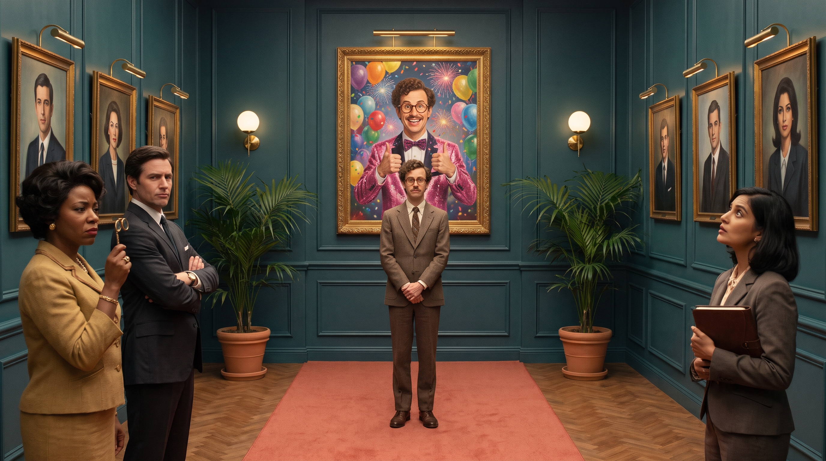
- holiday or party photos
- busy or distracting backgrounds
- low resolution or a visibly outdated shot
For the banner:
- The default banner: it signals an inactive profile or low effort.
- Unrelated imagery: random skylines, hobbies or abstract art that a visitor cannot connect to your work.
- Clutter: too much text, too many logos, too many messages.
Even a simple banner with logo and slogan beats an empty one.
“A banner is a billboard, and a billboard carries one message.”
Frequently asked questions
What is the right LinkedIn banner size?
1584 by 396 pixels, in high resolution. Keep text short and check on a phone that it stays readable.
What should a CEO put on their LinkedIn banner?
Company colours and logo, plus one message: a tagline, an authority signal or a call to action. Two messages on one banner compete with each other.
How do I know if my LinkedIn photo is good enough?
Look at one of your posts in the feed on your phone. If the small photo is instantly recognisable as you, it works. If not, replace it.
Do you help executives with their LinkedIn profile?
How CEOs come across on LinkedIn, photo and banner included, is part of my executive branding work. You can read more about my executive branding advisory.